Overview
After cementing the new JeffreyM branding, we turned our attention to the ultimate task: redesigning the website. Given the underwhelming aesthetics and structure of the old website, we knew we had our hands full. The goal: create a website that captures the new JeffreyM visual identity and resolves the lack of clarity around user flow.
The Problem
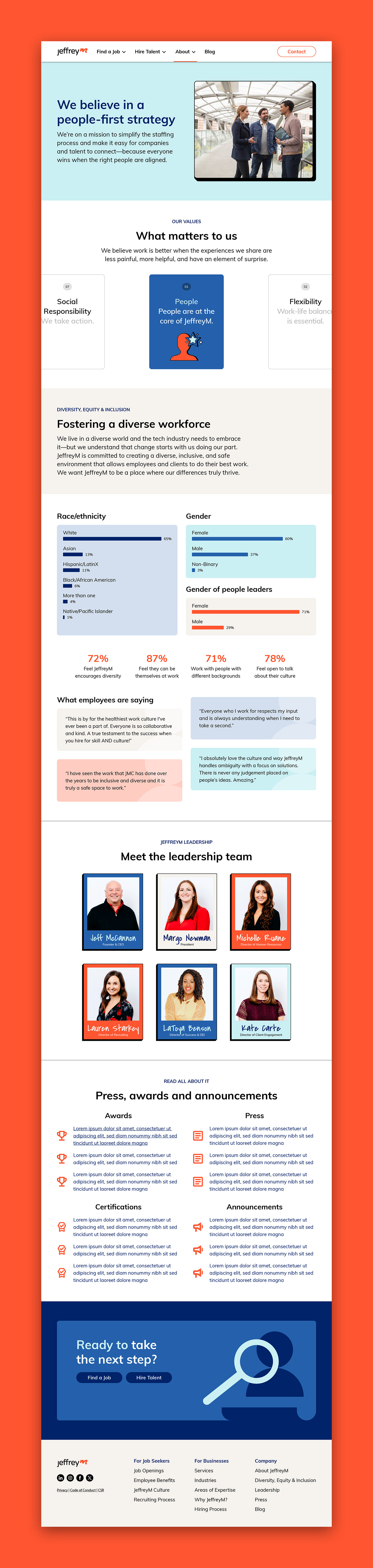
In addition to being outdated, the old website had unclear user pathways. At JeffreyM, we have two target audiences: prospective clients interested in using our services and the team members we hire to support those services. Prior to the redesign, the website's content blended together in a way that made it difficult to distinguish between information. Content intended for clients appeared side-by-side next to consultant information, and most sections featured vague titles and big block paragraphs that created unnecessary friction. Moving forward, we knew the website needed to be better at directing traffic—visitors should move naturally throughout the website, from the entry point to the final conversion.
The Solution
First and foremost, we worked hard to undo all of the website's structural problems. To improve navigation, user flow, and performance we:
-Better understood the user pathway. Per behavioral flow, ~80% of JeffreyM visitors start on the homepage, with 66% dropping off entirely and the remainder going to the careers page. Of the ~15% of visitors that begin on the careers page, the majority of drop off entirely, with a tiny portion moving on to the homepage. How do we address this? Bring available jobs to the top of the page and provide additional pathways (buttons/queues) that encourage visiting other areas of the site. Identify pages where users tend to drop off and understand what they like, what's missing, and the paths that they aren't taking but should.
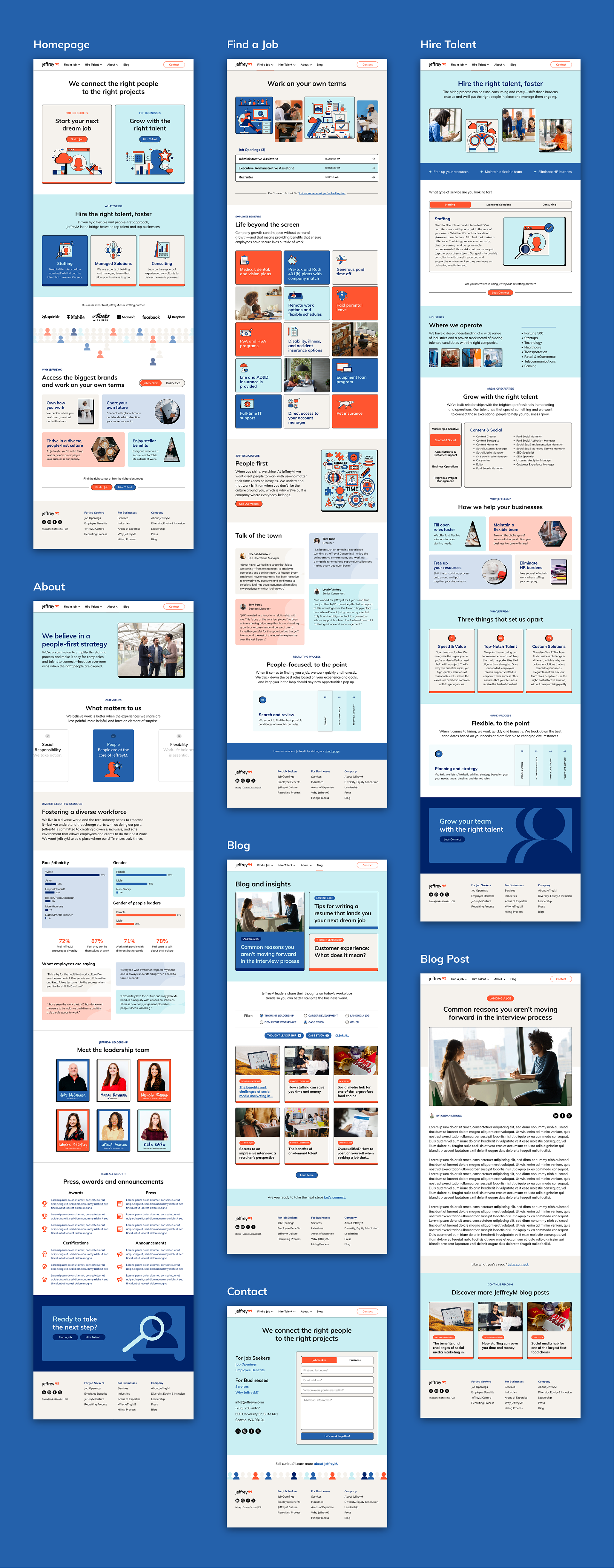
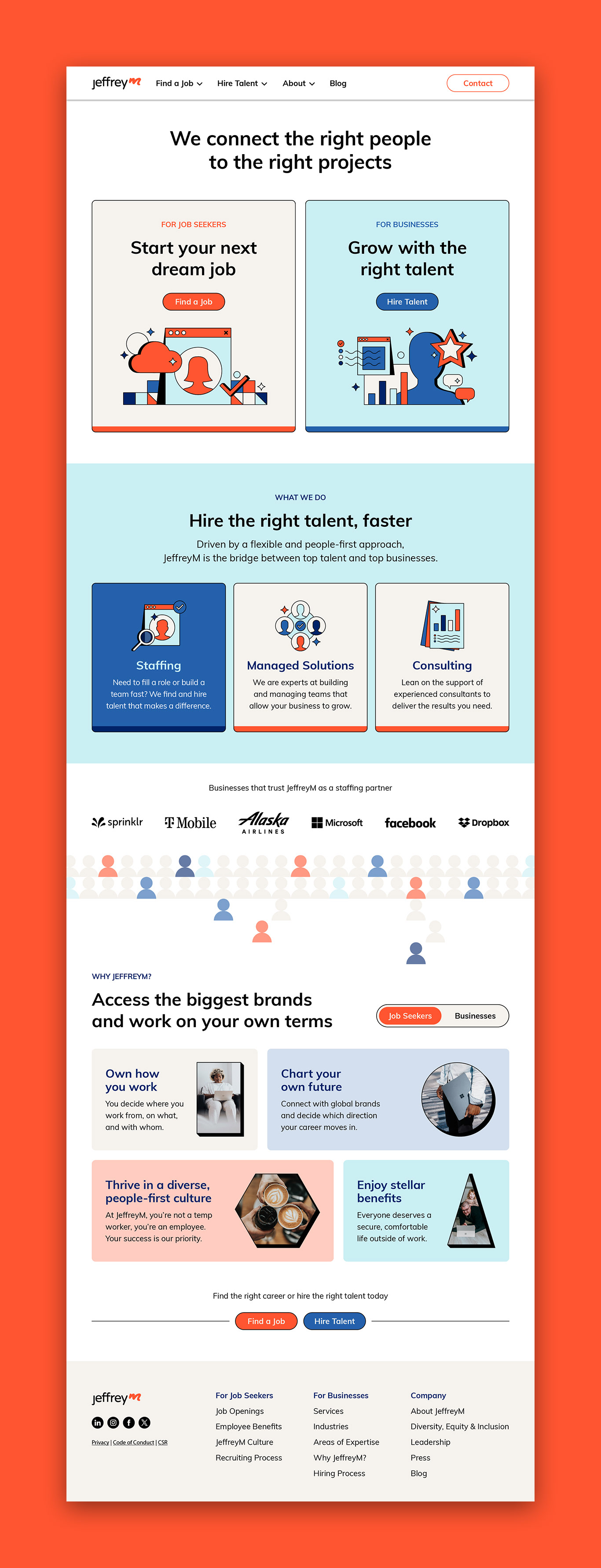
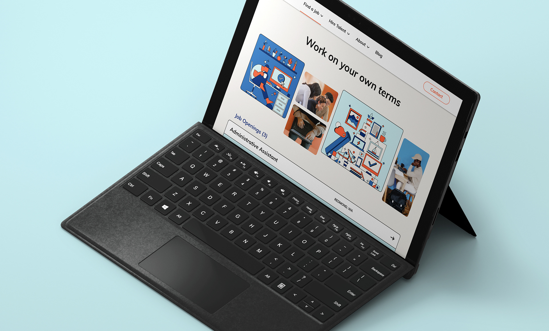
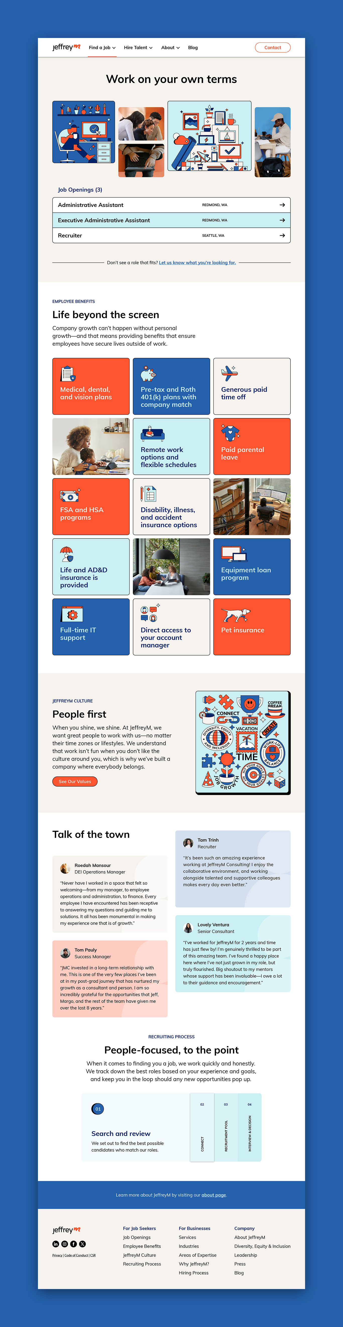
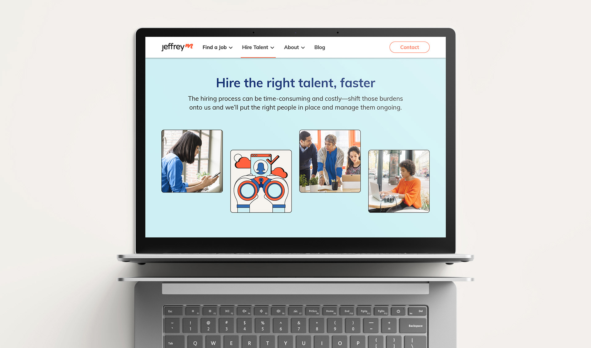
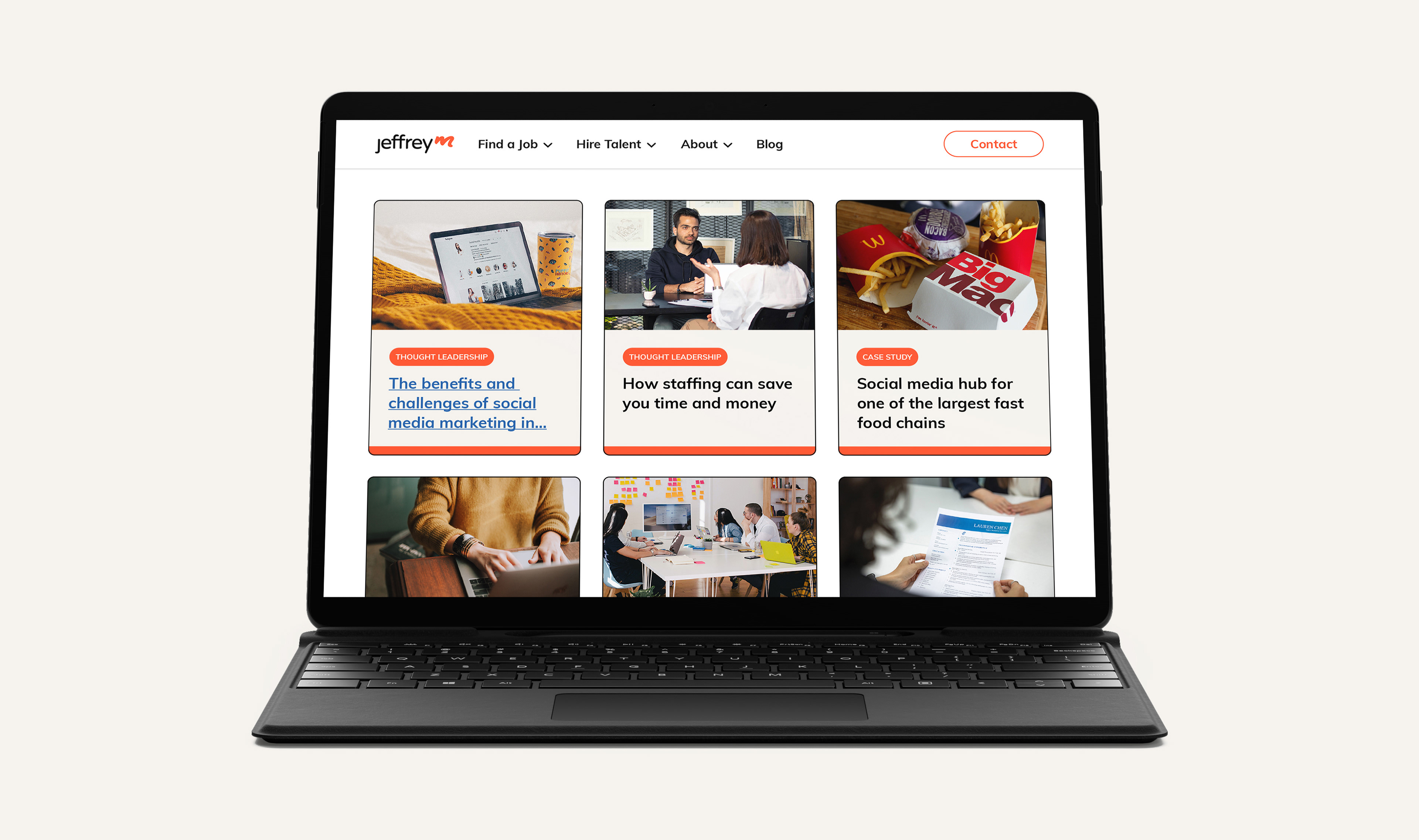
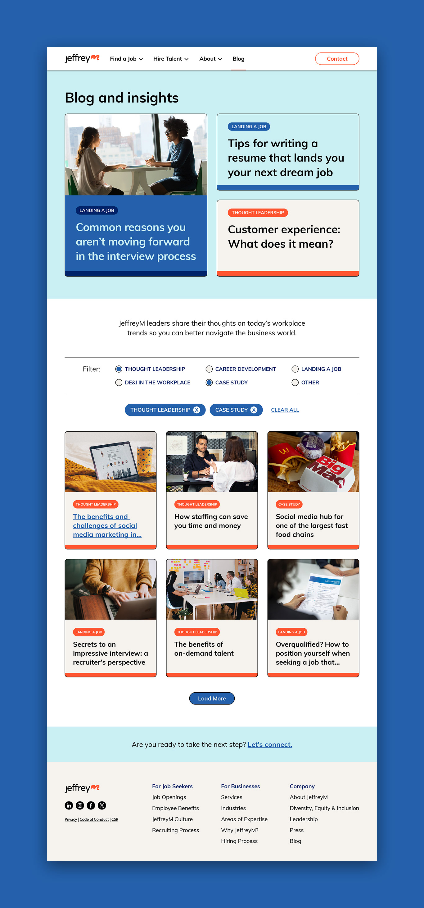
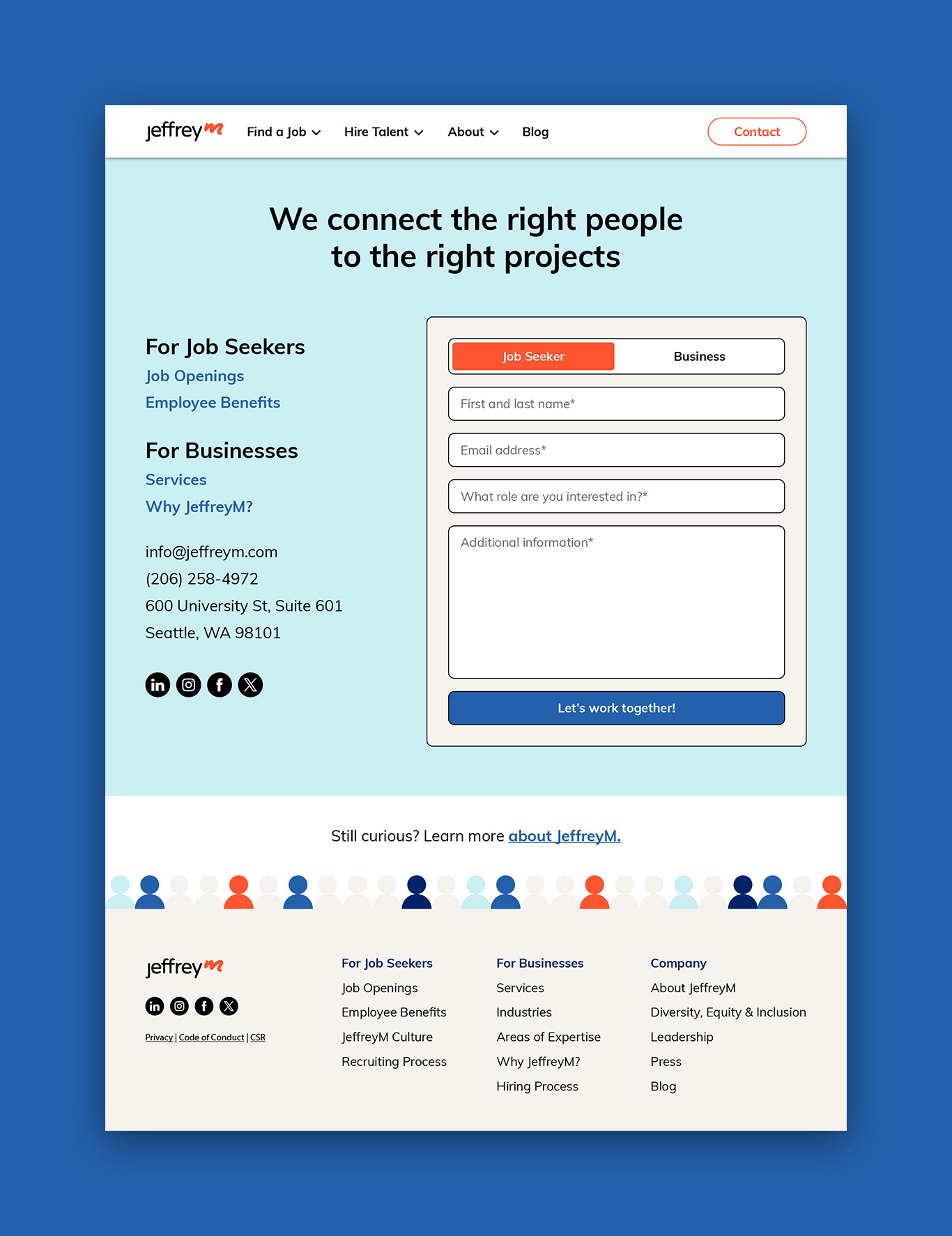
-Developed two clear user pathways—job seekers and businesses—and surfaced them so that visitors quickly understand which content is relevant to their needs.
-Simplified the pages. Users tend to stay longer when they're not bombarded with unnecessary information and design elements.
-Reduced the overall amount of text on the website, using a rule of thumb of no more than 50 words per section and ensure all text is accessible, including on mobile. 60% of text on a page should be 12pt or larger on mobile. Links and buttons (tap targets) should be at least 8px apart and 48 x 48px so they are easily clickable on mobile.
-Added contextual internal links. If people are interested in a topic, they will keep reading. If they're not, don't let them stop. Direct users to other pertinent information on the website using contextual internal links, as well as through the website's main navigation menu.
-Eliminated technical jargon and focused on using language that is friendly, clear, and concise.
-Reorganized the content using titles and subtitles so that users can get a quick sense of what they are about to read and easily jump between sections.
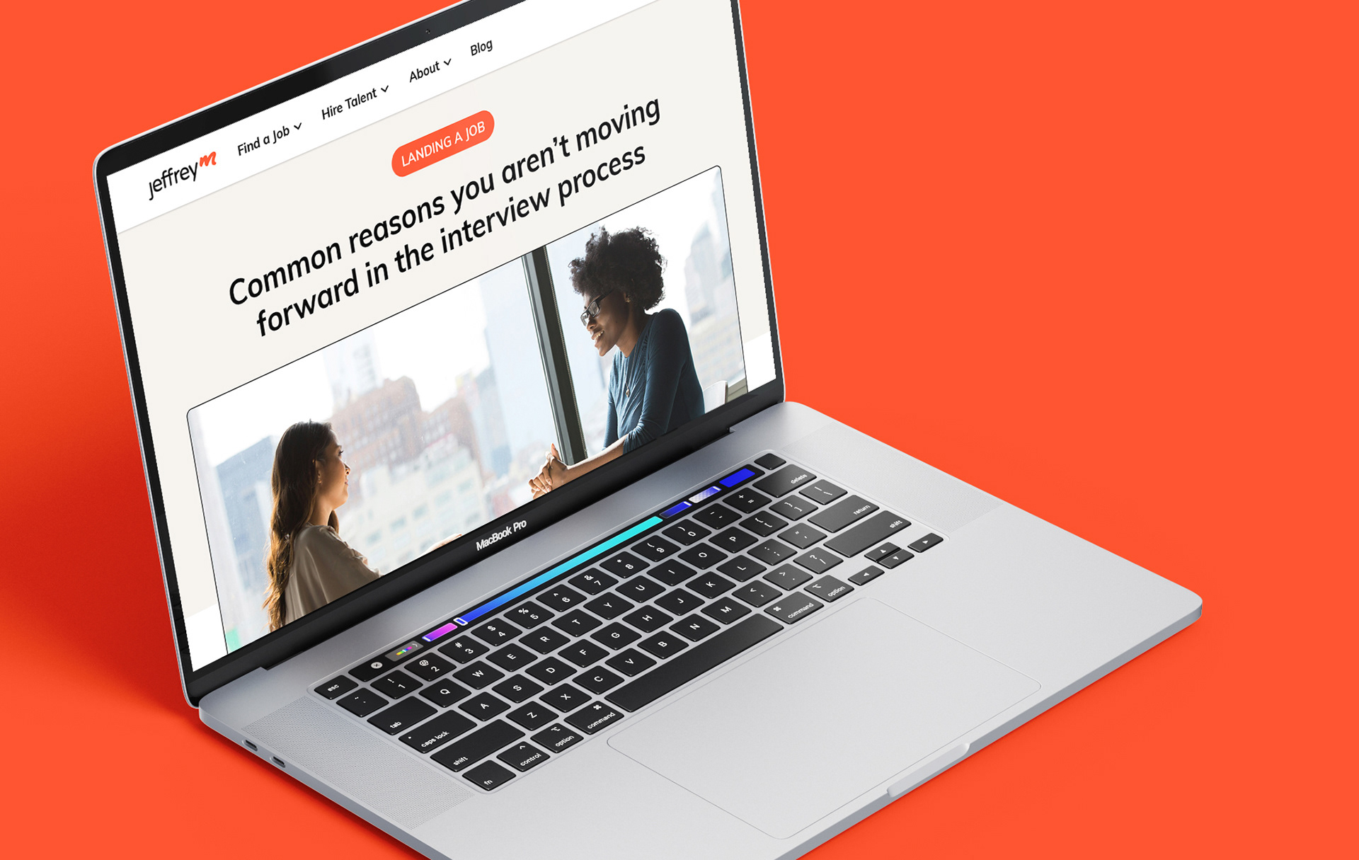
Broke up the text using engaging images, infographics, charts, etc.
-Fixed the upper navigation so that the primary links and CTA remains visible as the user scrolls..
-Surfaced the careers and contact links on the upper navigation, which offers additional shortcuts to conversion and funnels each of the target audiences to relevant pages without forcing them to search too much or think too hard.
-Improved the wording of the primary CTAs—"Find a Job" and "Hire Talent"—so that they are more specific and offer users a natural outlet while moving about the website.
-Created a singular contact page that works for both target audiences, eliminating clutter and confusion.
-Minified CSS and JavaScript files. When CSS and JavaScript is properly compressed, it makes the site run faster.
Reduced the page sizes to <3MB for optimal performance.
-Reduced HTTP/page requests. The fewer the requests the site makes, the slower it becomes.
Reduced image sizes by compressing existing images or replacing elements with SVGs and responsive graphics to limit load times.
-Removed unnecessary scripts and plugins from WordPress, as well as avoided URL redirects to improve page load times to 2-3 seconds.
-Improved SEO by adding meta descriptions and using descriptive links and buttons that explicitly tell visitors where redirects go.
-Increased the contrast between the text and background colors to ensure the website passes all accessibility standards and is WCAG 2.1 Level AA compliant.
-Designed and developed mobile web-specific screens to ensure accessibility across all devices.

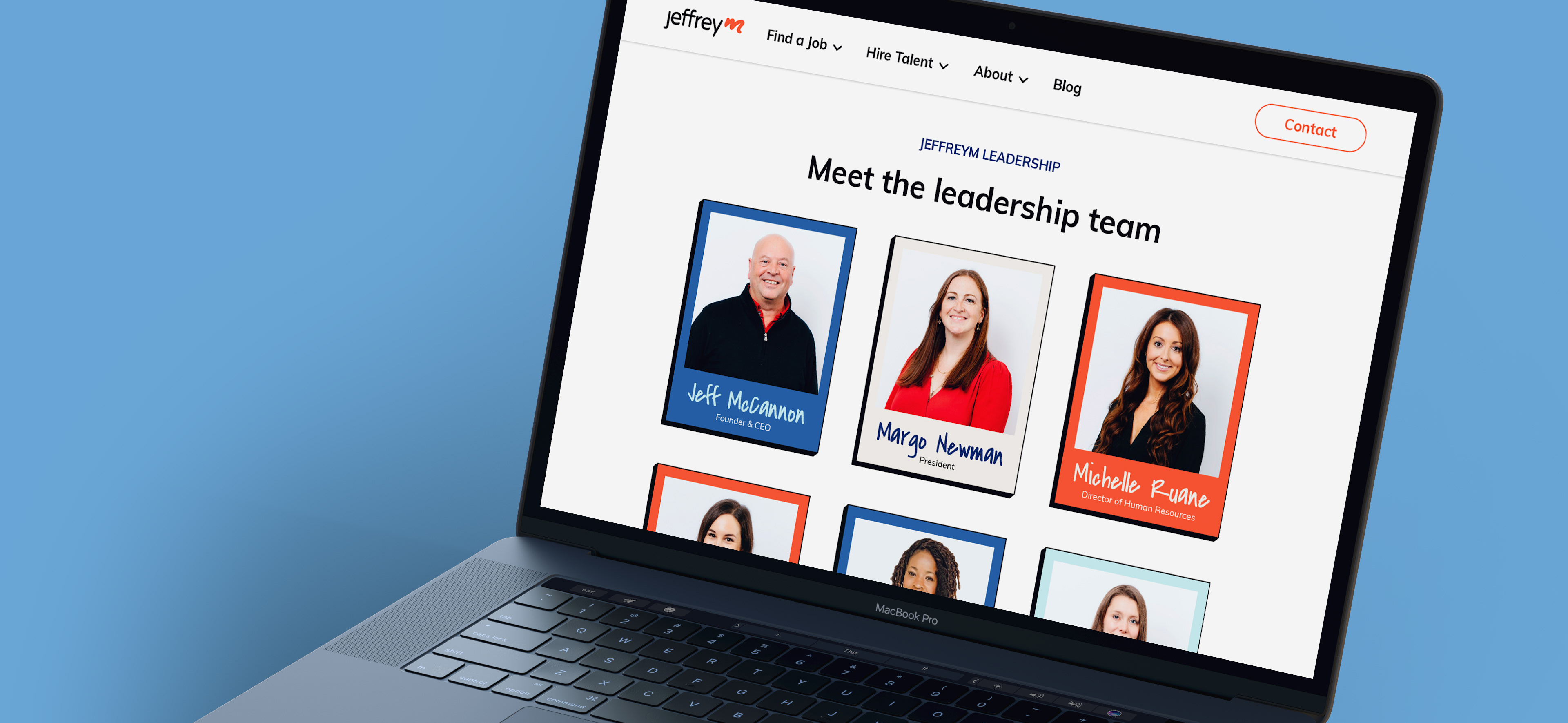
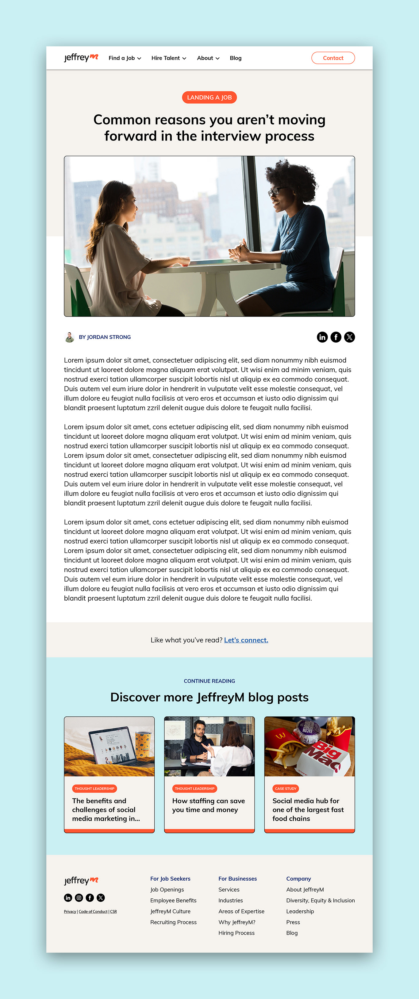
Next, we applied the new JeffreyM brand guidelines and used a consistent color palette to the visual design. The use of white space allows the content to breathe and helps guide the user between sections. The imagery is candid, modern, and engaging, and emphasizes JeffreyM's commitment to diversity and inclusion. We introduced iconography to help users quickly reference content, while still sticking with a minimalist approach and only adding design elements when they help clarify a point or enhance the information being presented.